There are a lot of poorly designed Facebook contests floating around the internet, but yours doesn’t have to be one of them.
Your Facebook contests need to convey your brand. They make your business more easily recognizable (and memorable) and encourage people to come back after the contest. And when they do, they easily recognize who you are thanks to consistent brand design and messaging.
Design and branding should never be an afterthought in any part of your marketing. This is why so many brands use Woobox to create visually appealing, on brand contests with minimal effort.
In this article, we’ll take you through a step-by-step example in the Woobox campaign builder and show you how to create a Facebook contest that engages your target audience and keeps your branding intact at the forefront. Throughout the example, we’ll highlight important tips to level up the design and branding for all of your online contests, quizzes, and rewards.
Create a Facebook Contest (aka Sweepstakes)
We’re choosing a sweepstakes (or contest) format because these posts garner very high engagement when done correctly, and draw in a bunch of new leads for your business.
If you have created campaigns prior, you will need to first select landing pages in order to access this menu.
When you log into your account, you will go to Create a Campaign and click Sweepstakes in the first row:
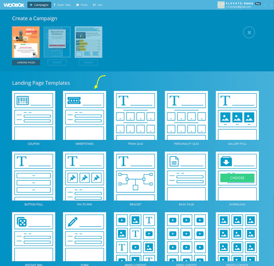
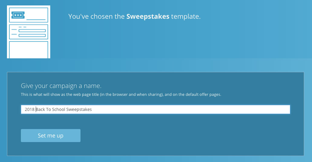
You will then be prompted to give your campaign a name. We suggest choosing something that is relevant to the theme or goal.
Next, click ‘Set me up’:
Next you’ll be taken to the main setup page where you can edit the details of your sweepstakes.
Looking for in-depth details on everything you can do on this page to create a Facebook Contest?
- Get step-by-step instructions for running Giveaways & Sweepstakes on social media or a dedicated Woobox hosted landing page.
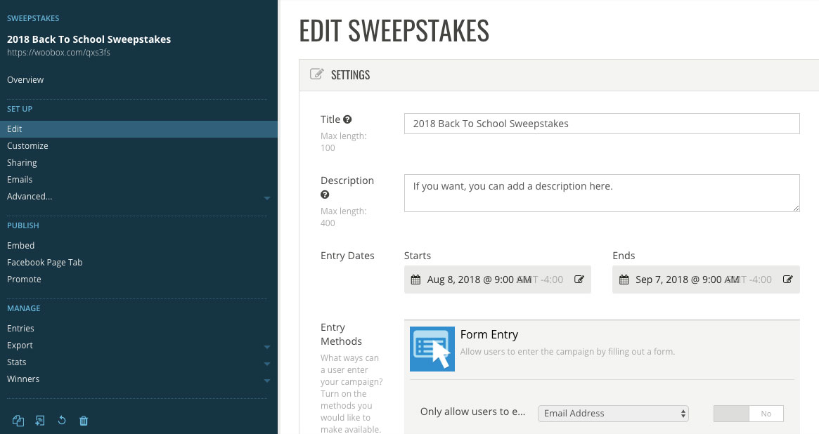
To begin designing your sweepstakes, click Customize on the left-hand navigation menu.
When starting fresh, you’ll see this page:
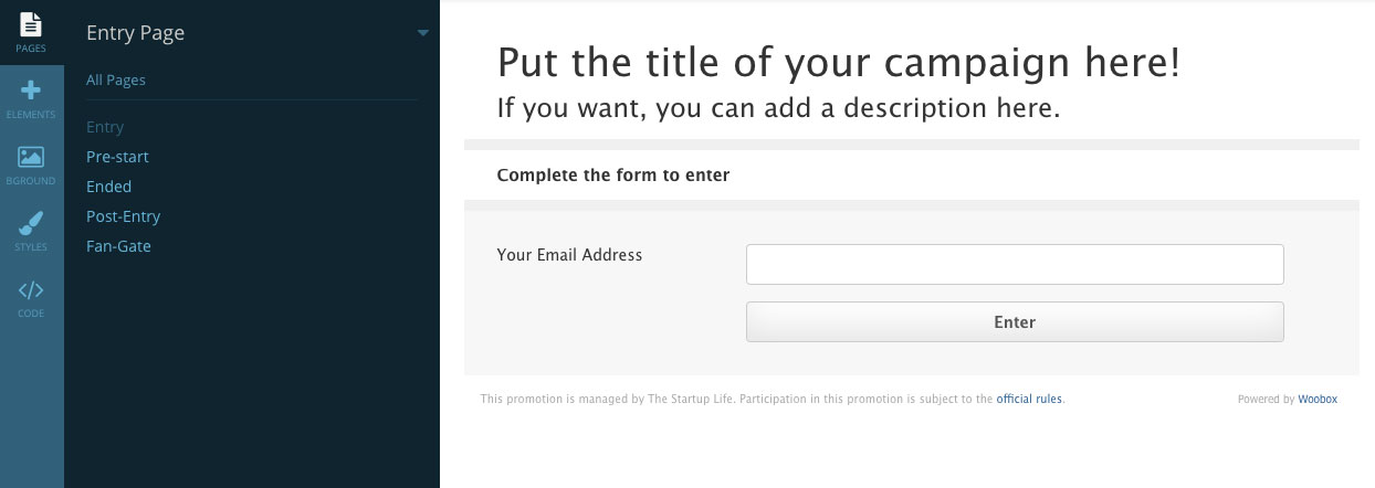
To learn how to use this page, check out the Navigate Your Customize Page guide, and learn how to customize even more like backgrounds and fonts for your sweepstakes here.
Next, we will go through a campaign example from a popular brand, and talk through the important design and branding considerations as you set up a campaign.
What You Need Before Customizing Your Facebook Contest
For this example campaign, we wanted to use a company with high brand recognition, that is known for their design and brand messaging. So we chose Zappos, the popular online shoe retailer well known for their brand personality, and simple, beautiful imagery.
Before we build out a contest campaign, let’s talk through the branding, design, and communication checklist to make sure the campaign is both effective and on-brand.
1. Have your campaign goal(s) crystal clear, and tie any goal(s) to a larger company goal
For this campaign, we’re going to launch a “Back to School Giveaway” and promote a $500 gift card as the grand prize towards a back to school shopping spree.
The example campaign’s goal? Generate new leads that Zappos can promote their back to school lines to. Another goal of the campaign will be to generate awareness and become a part of the coveted “evoked set” in their customers’ minds when they are thinking of making their back to school purchases. In brand marketing, an evoked set is a relevant group of brands that a customer is favorably familiar with and considers first when making a purchasing decision.
2. Create campaign design assets consistent with your image by referencing your branding guidelines
A branding guide is an essential component to reference for not just any campaign, but anything that you are putting into the public eye about your company. Zappos has their branding and style guide public, and it can be referenced below.
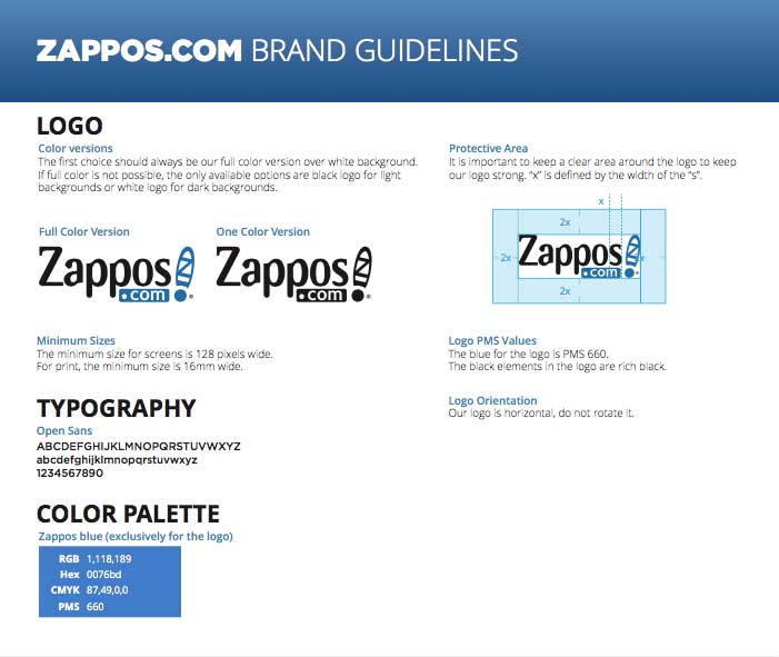
Keeping your design elements consistent is important for brand recognition and awareness (a major part of our campaign’s goal.)
Your brand guide should include your brand font preference, your brand colors, and your logo specifications at a minimum. A more in-depth guide will also have elements such as voice styles, secondary colors, key messages, and more. When creating the assets for your contest campaign, it’s important to design with this in mind, and make branding consistency a focus.
Zappos is known for its simple, product-focused design. So we will keep this intact for the campaign. We’ll also make sure to use their preferred font “Open Sans” and their core blue branding color.
3. Less is more with Facebook contests and online promotions
With an online contest, the less you have, the better.
At first, this might seem counter-intuitive. However, it’s important to keep the messaging straight to the point, and focus on having a great title and a clear call to action.
The image should be eye-catching, but not overbearing, and your prize should be relevant to the audience you are wanting to attract.
Your last (and perhaps most important) consideration: keep your entry form as short as possible. Make sure you capture only the most important information to further the effectiveness of future campaigns and messaging follow-ups.
4. Ensure the prize relates to your business
While it may not seem like it, this is still an important branding consideration. Giving away a prize that’s wholly unrelated to what your business does will not leave consumers thinking about your business down the road when they need or want your product/service. If you have a service-based business, give away free services or tie in a charity or product that relates to your business and speaks to your brand’s values or beliefs.
5. Double-check that your image sizing is correct
Again, this may not seem like a big deal, but nothing is worse than a poorly cropped image (especially when text is cut off).
Woobox provides image specs here for your contest campaigns, and Facebook provides advertising and image specs here.
Here are some examples of images we created or picked for this back-to-school campaign, keeping those 5 branding and design considerations in mind:
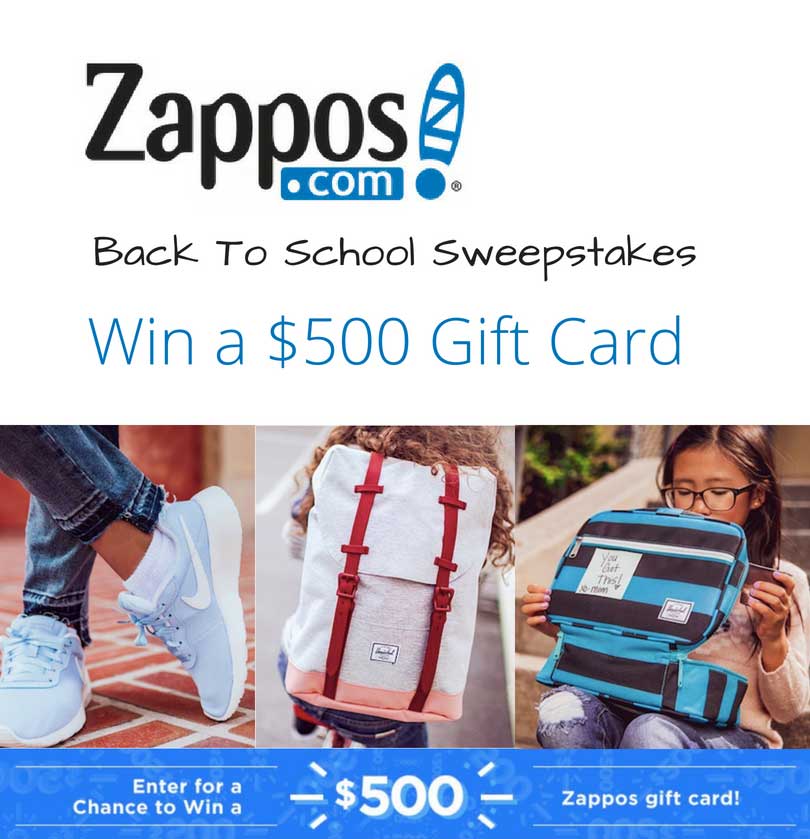


Now let’s finish creating our campaign in the Woobox dashboard.
How to Create & Customize Your Facebook Contest Landing Page Experience
Woobox has 5 pages available to design and customize for your Facebook contest. You can reference this guide to learn how each page is used in the contest, and what design and content elements should appear on each.
We’ll start by designing the entry page, where visitors can learn about contest details and fill out required form fields:
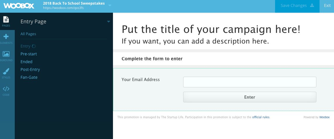
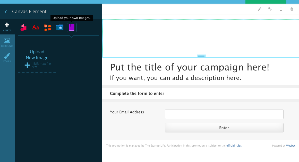
Since we created an image for this page, we’ll go to “Elements” on the side navigation, and add a “Canvas” to the page.
If you don’t have pre-made image assets, you can still customize the page using Woobox’s free design elements. Remember to stick with your pre-selected brand colors, aesthetic feel, and typography.
You can learn how to customize using Woobox “Elements” here.
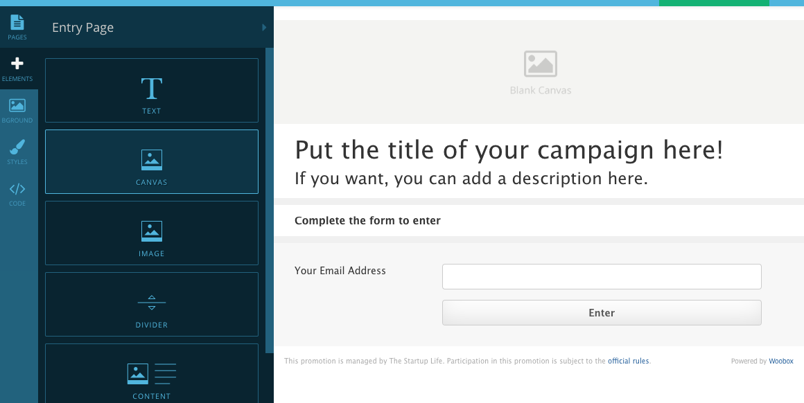
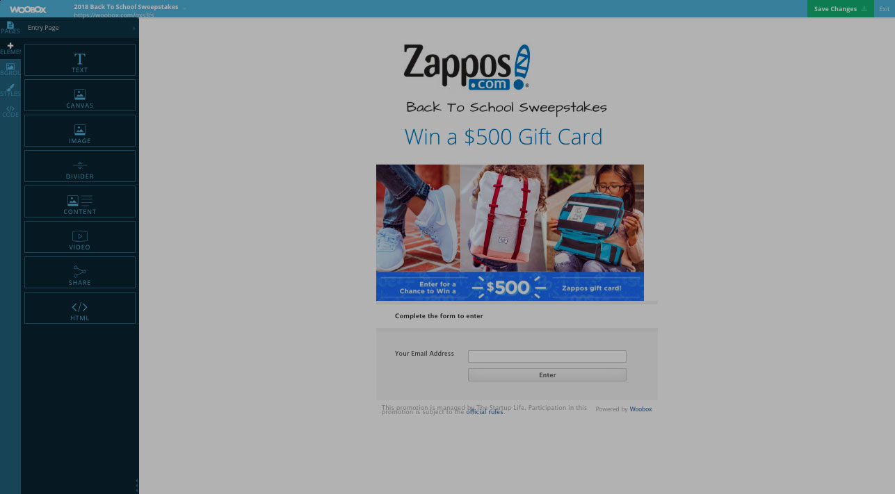
Next, we’ll upload our custom image:
Here is what the entry page will look like so far:
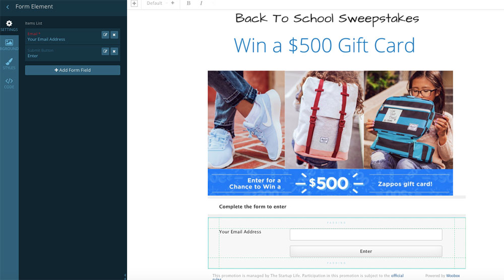
Next, we’ll customize the entry form, because like we said in our design considerations, we need to capture necessary information without making the entry form too long.
Initially, you will have a default form with just an email input. To customize your form, click directly on the form, and head over to the left navigation menu to make edits.
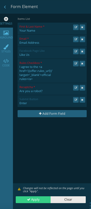
We’ll add a first name, last name, a suggestion to “Like Us on Facebook”, contest terms agreements, and a spam stopper.
Then we’ll click the green Apply button (bottom-left) to change the form:
Next we’ll edit the font (to the branded Open Sans), along with the form outline colors (to the branded blue), the form text, and even the form button shape and colors:
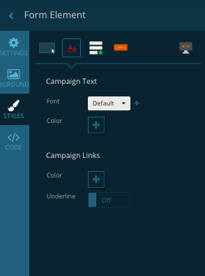
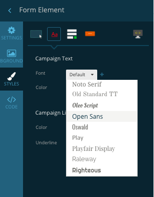
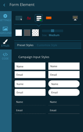
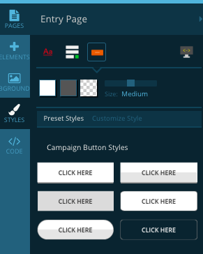
Here is what the form looks like now:
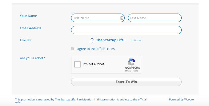
As you can see above, we stuck with the clean and simple design Zappos is known for.
Now, with the Entry Page marketing assets in place, we can edit the background pattern or colors of the landing page, or even add more elements such as text or photos.
But, first, let’s focus on our background. For example, using Woobox pre-installed background options, we could make the contest background color this yellow pattern:
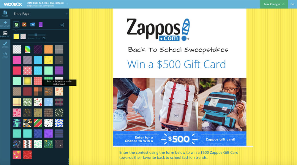
And while the yellow pattern does allow the blue to pop, Zappos design is very clean, so we’ll switch to a straightforward, minimalistic design for the final page:
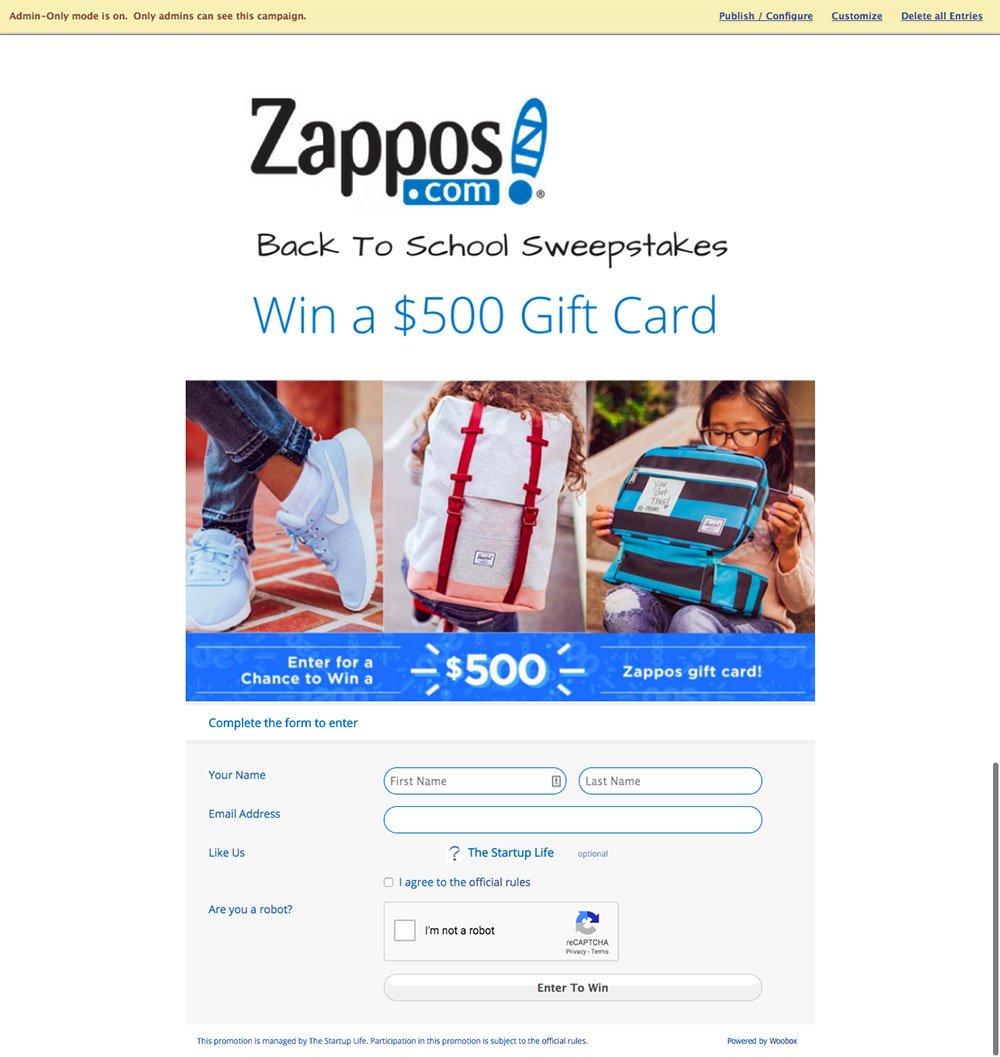
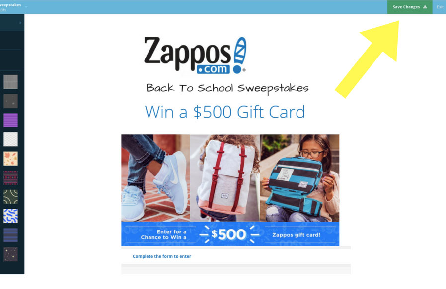
Don’t Forget: Before switching to designing another page, remember to save your progress by clicking the upper-right green save button!
We then move from designing the Entry page to designing the Pre-Start page, where incoming visitors are sent prior to the main contest Entry Page.
Looking at the left navigation menu, having the default page selected should look like this:

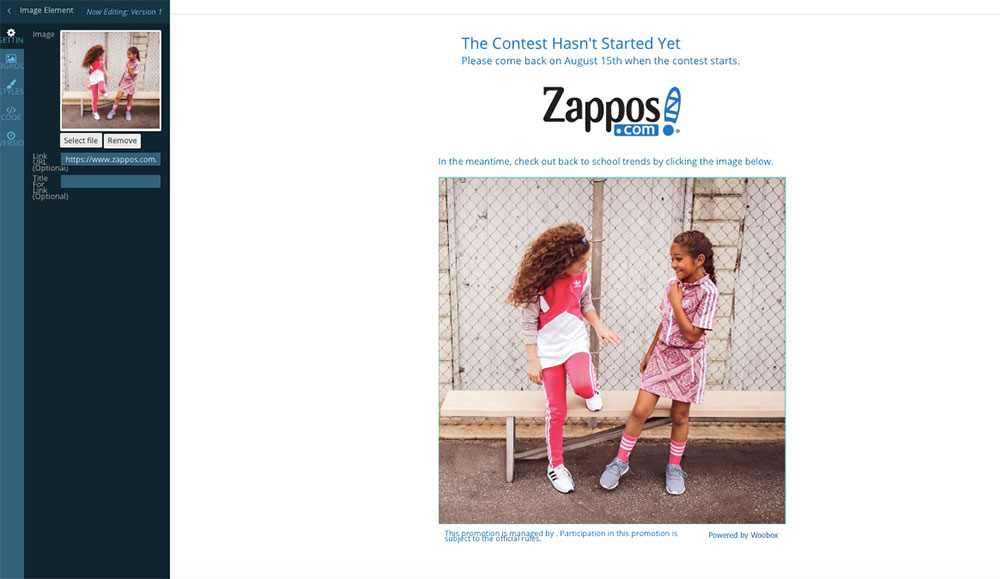
Again, using Woobox’s customization options, which you can learn how to use in detail here, we stayed with a simple image, logo usage, and branded typography. We also used this page as a promotion tool to get visitors to check out Zappos “Back To School” products to redirect relevant traffic and customers.
Here’s the final result of customizing our Pre-Start page. We’ll include messaging about the contest not quite starting yet (for any excited customers) with a small call-to-action just in case:
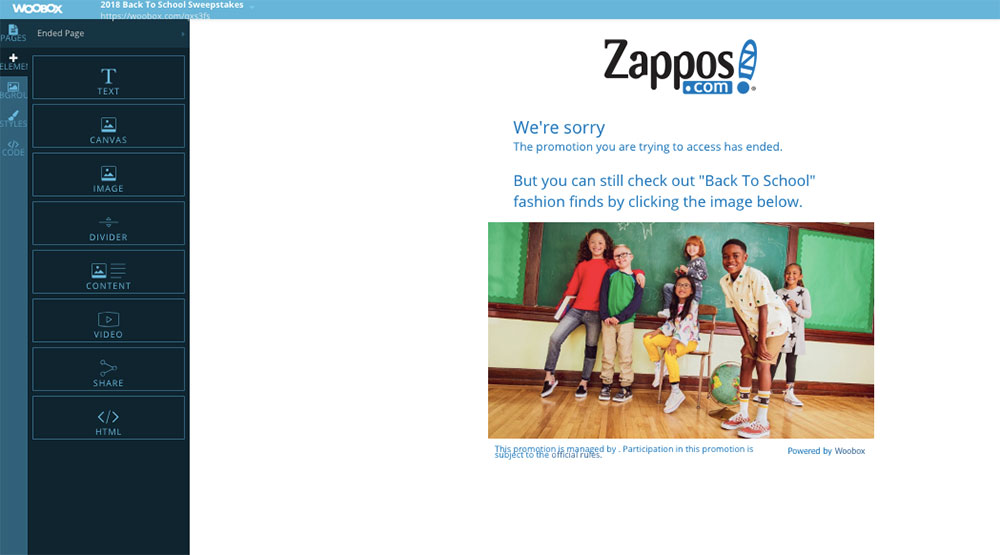
We kept the same idea with the Ended page, which entrants are directed to when the contest is completed. This is definitely a best practice for making the most of your contests, even after they’ve ended:
And the last page we’re editing in this contest is the Post Entry page, where entrants are redirected after entering their information.
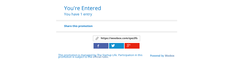
The main goal of this page should be to confirm with an entrant that they are successfully entered. We also stuck with our strategy of redirecting them to the Back To School page to browse products.
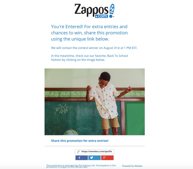
We highly encourage adding share elements and giving contests extra entries for sharing the contest on their social page with their unique link to keep spreading the message. When someone sees a new contest through a friend or family member’s updates, it creates a warm introduction to your brand.
Here is the final page:
4. The final pieces before publishing and promoting your Facebook Contest
We’re almost finished! Just a few more things to take care of before sharing your Facebook contest.
Creating Your FB Share Message
On the left navigation, under the SET UP section, you’ll see a menu item named Sharing. This button allows you to customize the image and message people will see when the contest page is shared.
You do not want to leave this up to default settings.
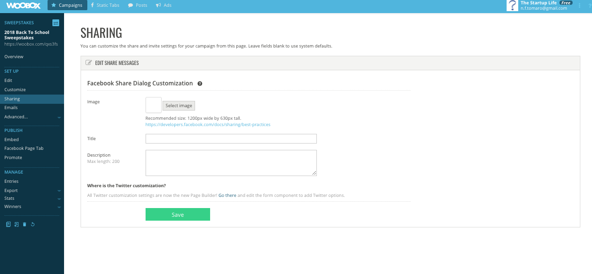
Here’s what we updated the Share settings to for this contest:
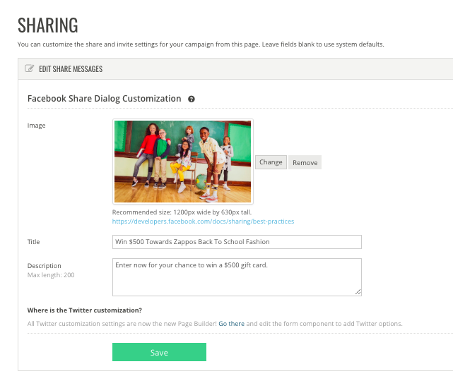
Note that we used an eye-catching, simple image, that is product focused and on brand. We also used very direct messaging that lets the person know there is a contest and what the prize is for entry.
Make Sure You Include Your Contest Rules
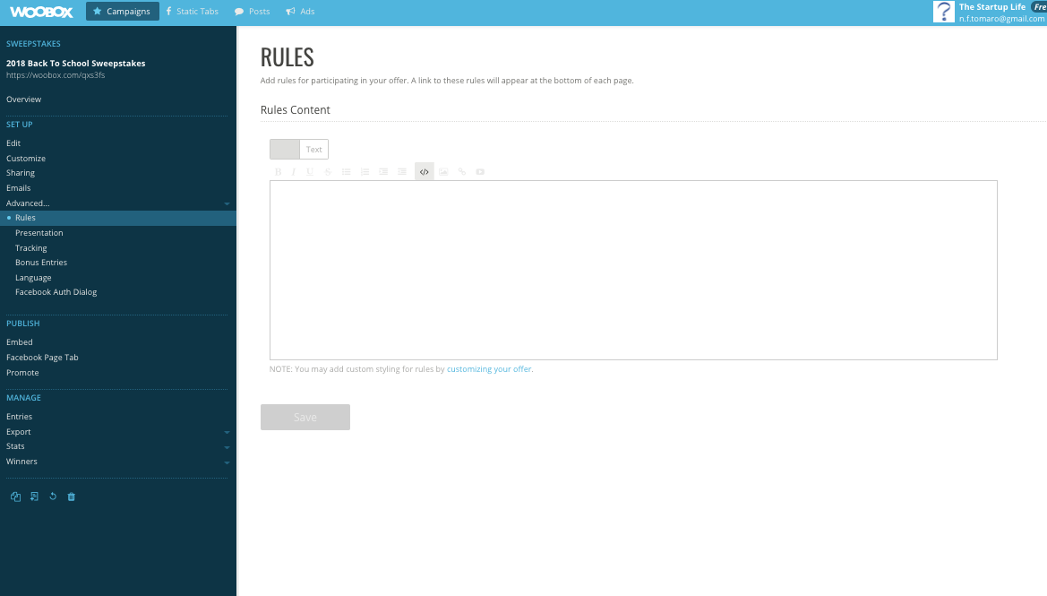
This is really important and legally required for any type of contest. Use this page to add your contest rules.
Create a Tab for Facebook
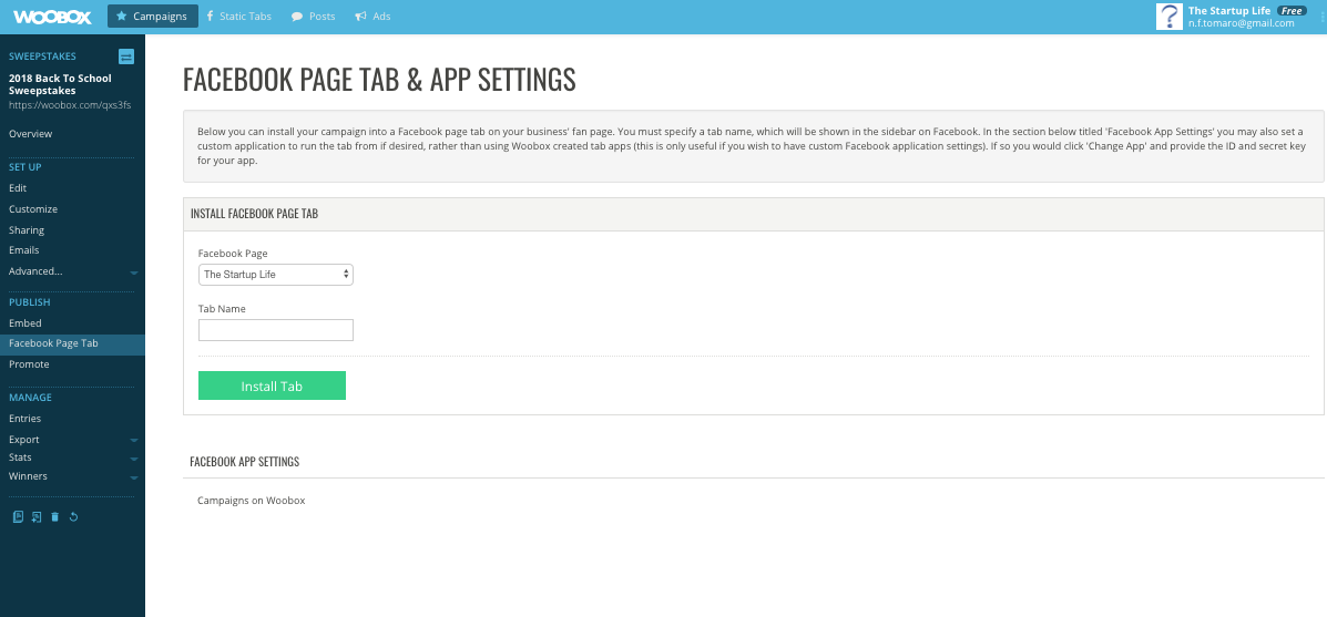
The last thing we highly encourage you to do, though not a requirement, is to use the “Create a Tab” feature on Woobox to have the contest live on your Facebook page. A tab can help you capture visitors that may not come through your advertising and promotion around the contest.
5. Advertising Your Facebook Contest
Remember to stay consistent, and use the same branding rules and guidelines we covered at the beginning of this campaign. Facebook has specific image sizing and font rules that you can learn more about here.
Important: any promotion you run on Facebook should keep the text within images to a minimal, otherwise it might get flagged. Facebook’s rule says 20% of the image may contain text. This rule benefits us in this campaign as Zappos already has a minimalistic design style, with minimal text, and all of the focus on the photo.
We would suggest using a simple image like this for the campaign, getting across the brand name and feel. And then include “Enter now to win a $500 gift card for back to school fashion” as the post description.

Conclusion to Creating & Designing Branded Facebook Contests
Your branding and design matters. A well-branded company has top placement in a person’s mind. For example, when we think of Apple, we often think of innovation.
Design and consistency are a major part of the branding process and are necessary to create a strong attachment and positive association with your target audience.
We utilized Woobox customization tools to build this entire Facebook Giveaway. Creating a contest or any one of Woobox’s many marketing campaigns is free. You can make as many giveaways, contests, quizzes (or any promotion) you like! A subscription is only required to publish and run a campaign.

