If you’re new to Pinterest you should consider starting here for an in-depth guide to setting up a powerful Pinterest business account and the steps to prioritizing and organizing your pins.
Pinterest’s Smart Feed is responsible for prioritizing and ranking pins based on their quality. The rule of thumb for creating engaging and successful Pinterest graphics is to enhance not only the quality of the graphic, but the links, headlines, and assets associated with it.
Above all else, every graphic you post to Pinterest should be optimized for search. From the hashtags to the name of the image file, your graphic needs to be as search-friendly as possible.
The new Pinterest Smart Feed looks for quality through various lenses, like the strength of the domain linked to your graphic or the reputation of the Pinterest account posting the graphic. For an in-depth look at Pinterests new 2018 Smart Feed algorithm, jump on over here to learn more.
Let’s jump right in and take a look at some of the best practices for creating engaging Pinterest graphic’s that will engage your audience to click and entice them to keep coming back for more.
The Image Matters
A powerful visual search network such as Pinterest places emphasis on the quality of the appearance of your pins, especially the images. The more attractive or enticing an image is to a consumer, the likelier they will be to click through that pin to your website.
High-Quality
It’s no surprise that having a high-quality image will make your pins more noticeable than those with sub-par images and sloppy designs.
Luckily there are many ways you can find high-quality images online for your graphics, some of the best free and paid options include sites like Death to Stock, Negative Space, Unsplash, Adobe Stock, and PicJumbo, just to name a few.
Quantity
Unsure if your graphic needs multiple images? Consider the type of content your pin is promoting. Using multiple images within your graphics can work well for outfit posts, roundup-style posts, and before/after transformation posts.
Ask yourself: “Can the content I’m sharing benefit from a hyper-visual pin with multiple images?” Maybe your pin topic is centered around food and recipes, DIY projects, or craft projects. These types of posts benefit from multiple images that show the steps or stages explained in the content.
Keep in mind that you don’t want to over-do it and overwhelm the consumer. Instead, you want to appeal in a way that is helpful, not distracting or confusing. The whole point of creating a quality pin is to quickly provide valuable information on a visual level.
The Long Pin Debate
Yes, length matters, here’s why…
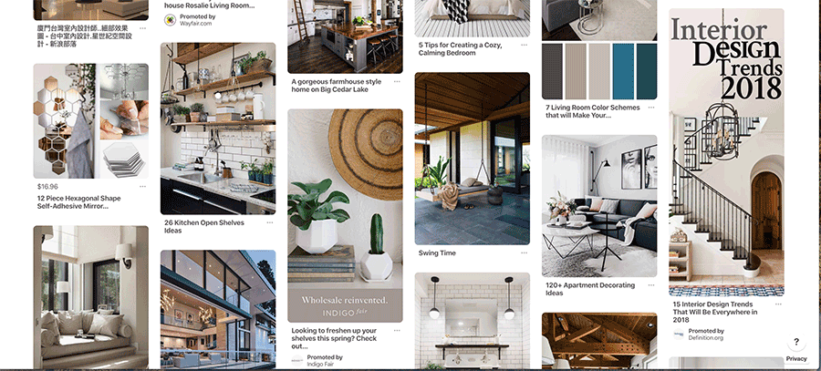
The Pinterest grid system is designed into columns of scrollable pins allowing for longer graphics to set the stage and stand out within the Smart Feed.
If you really want your graphic to stand out on the page then you should consider how it appears within the feed and know what length works best depending on the graphic as a whole.

The content that’s linked to your graphic will help determine the image you use, which in turn will help you dictate the overall length of the pin. Notice above how the long pin graphic on the far right of the feed is designed to catch your eye and gracefully direct it down the pin itself, leading you to the title and hashtags underneath.
Go for taller Pins. Vertically-oriented Pins look better on mobile screens.
Taller (or longer) pins look great on mobile, which is crucial, considering that 80% of users access Pinterest through a mobile device.
In the last year alone, 58% of North American social media users accessed services through their mobile device instead of a desktop or tablet, and that number is growing at a rapid rate.
In short, optimize those graphics for mobile and we promise you’ll go far.
Pinterest Image Size Guide
- Smallest ratio 1:1 – 600 x 600
- Longest ratio 1:2.1 – 600 x 1260
- Optimum ratio: 2:3 – 600 x 900
Pins are organized into columns, so vertical Pins take up more space and tend to stand out more. Beware, don’t make Pins too long or they will get cut off by the feed.
The ideal aspect ratio for a Pin is 2:3 (600px wide x 900px high).
Overlay Post Title
The post title on any type of content you use for marketing purposes should always be well researched and relevant to your audience. A strong headline for an article might not be the best post title for all social media platforms, but your headline message should always be true to the linked content.
On Pinterest, overlaying your post title onto the graphic is a great way to include a stylized design that recognizable to your brand followers.
The graphic design and overlay should express the benefit or value that pin offers the consumer. The overlay title should be short and sweet, so it avoids taking away from the power of the paired image.
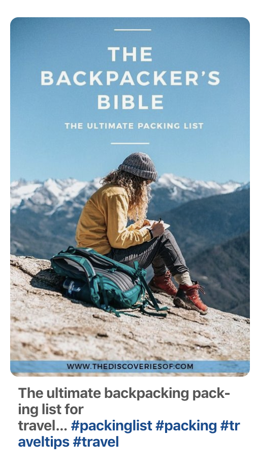
Below, Osprey used the title to grab attention, and the image to inspire visual interest in the Pin before ever reading the overlay.

In many ways, the overlay can add layers of meaning to your graphic as a whole, it tells a story and emphasizes your brands priorities.
There is such an importance in being truthful with your post titles and your graphics as a whole. Consumers don’t like being mislead or baited. All of your pins should be relevant and meaningful and they should never promote information, answers, or content that doesn’t exist at the link behind the graphic.
Mock-Up Show Off
A very powerful way to create a graphic that grabs attention is to include a mock up. Mock-ups show Pinterest users that the product or service your pin is advertising is actually a real tangible thing.
Using a mock-up as a visual asset in your graphics can be a highly effective way to draw a consumer in for more.
Yes, you can be a tease, but only if you follow through on your promises. Everyone on Pinterest knows what it feels like to fall for an enticing clickbaity graphic, and all marketers know that’s the number one way to turn off consumers.
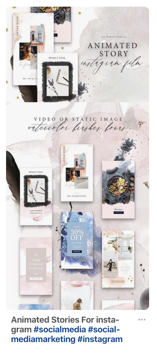
Here’s an example of using a mock-up in a branded design that encourages users to click on the graphic to learn or see more. It’s effective to personalize your graphics behind the mock-ups to show your own personal branding on top of the services offered.

With more than 14 million articles Pinned every day, the quality of your graphic is paramount to gaining traction through your Pinterest business account. Don’t be afraid to bend the rules and create refreshing new graphics, but always double check to make sure you’re meeting the best practices for visually appealing pins.
Woobox makes it easy to practice creating compelling graphics without spending a dime until you’re ready to publish to your feed. Check out the exciting ways you can tell a compelling story through something as simple as a graphic.
Invite fellow pinners to keep visiting your boards for more and don’t forget that the best content is valuable and helpful to your audience. If you put their needs first, your graphics will be sure to shine!
