Facebook is rolling out a new timeline design, and many Page Admins are voicing their concerns – page tabs, which are currently prominently featured with an image, will now be text links. Those of us who have been doing this for a while will remember that’s how they were before the current design.
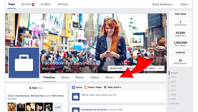
The new timeline layout features five page tab links, three of which are permanent and can’t be changed (Timeline, About, and More), the other two (currently shown as Photos and Videos in the example below) will be modifiable to any custom page tab you would like (Sweepstakes, Photo Contest, Twitter, Pinterest, etc), with the balance of your page tabs viewable under the “More” option:
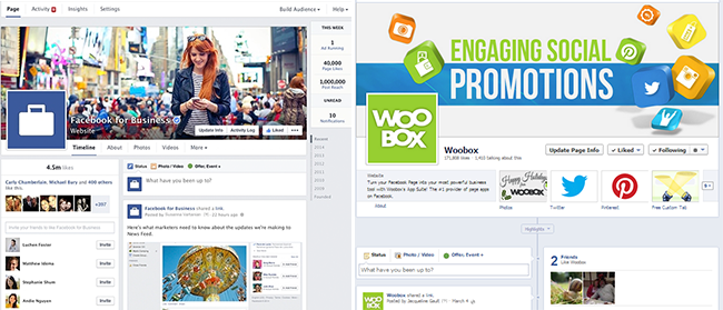
Page Admins are concerned that their page tabs will no longer be relevant, and won’t be visible to their fans. However, when you look at a side-by-side comparison, you will notice that the new tab links are much closer in proximity to the newsfeed – the old timeline had a whole lot of real estate between page tabs and page posts, which is where engagement occurs. The new layout places the tab links directly above the newsfeed and the simple, non-cluttered layout grabs your attention!
We’ll have to wait to see what the numbers say, but it’s very possible the new placement will have a positive impact on page to tab conversion. We’ll be keeping up on developments as the new timeline rolls out. Agree or Disagree? Let us know in the comments!


