

Mobile-First Design with a More Native Experience
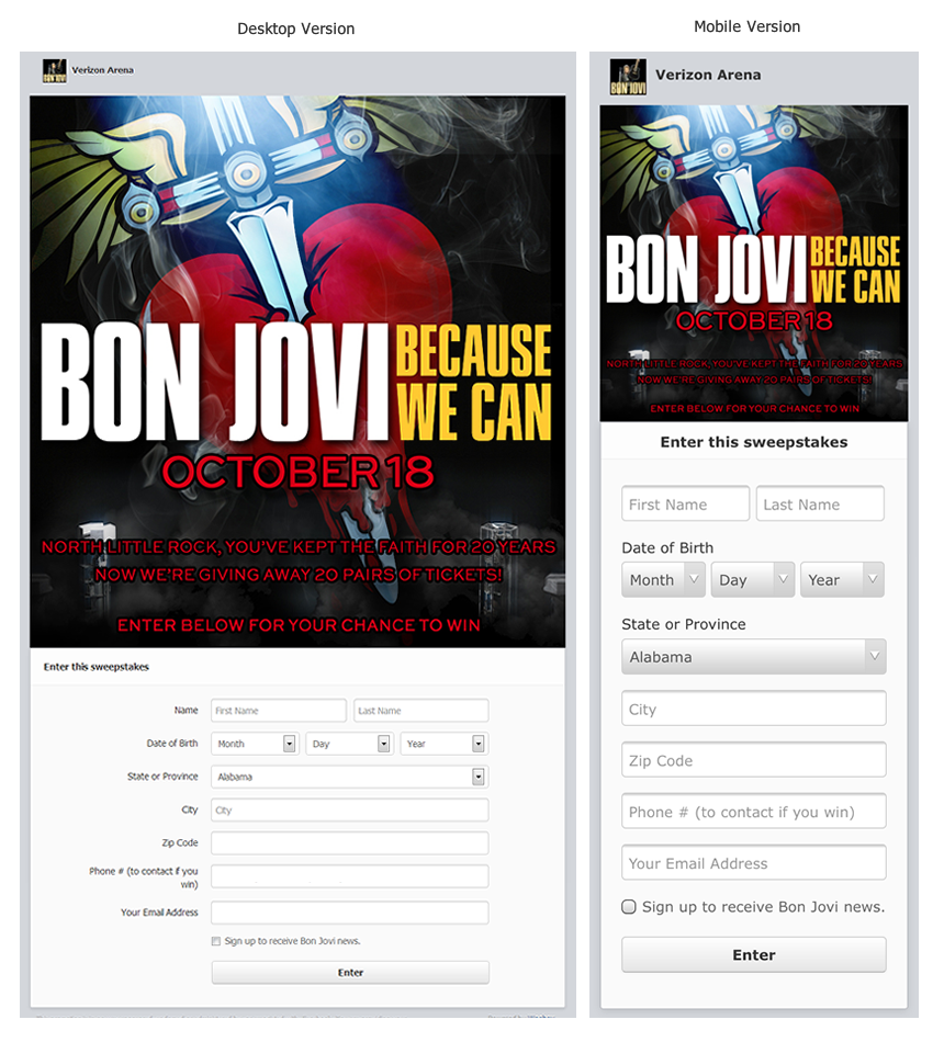
We completely redesigned the apps from the ground up for mobile, then scaled up the designs for desktop and Facebook Page tabs, creating the highest converting mobile experience we’ve ever had. The new design layout is cleaner and more intuitive, and mirrors the experience that most users are accustomed to when dealing with apps. Below you can compare the desktop version and mobile versions of a promotions from Verizon Arena. This promotion used an uploaded image with form fields. The Woobox platform handles automatically showing the most appropriate view for the visitor based on their screen dimensions.
Complete Form Layout Overhaul
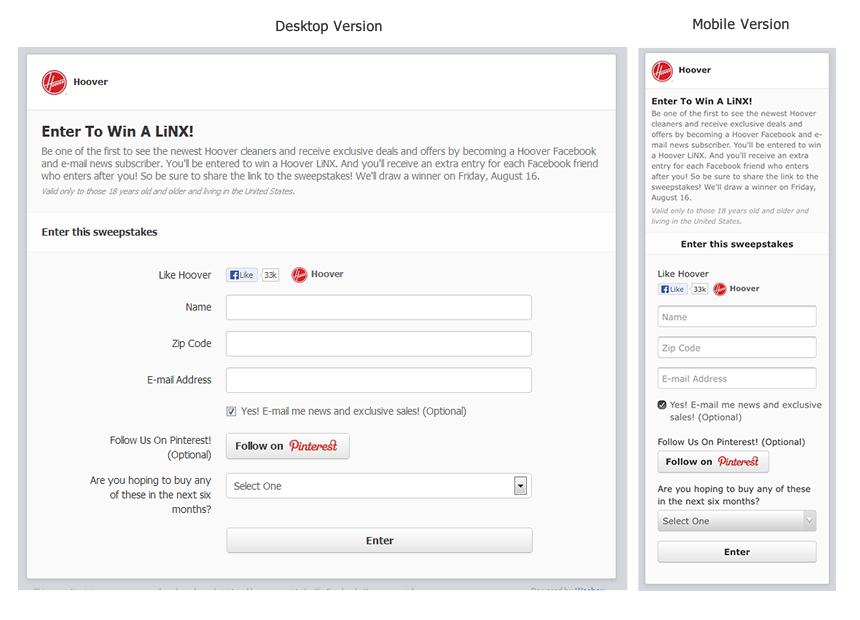
Our new form field layout is cleaner and easier to navigate for both mobile and desktop users. In addition to being more aesthetically pleasing, the new responsive mobile-friendly layout scales to fit on mobile devices regardless of their screen size. Below you can see a Fangate in action on both desktop and mobile. The user must Like the Hoover Facebook Page to enter the promotion. We’ve updated the styles on all of our form field types including the special ones such as the Pinterest Follow button in the example. We tried to design a layout that would look great even when you’re not using images. In the example below, you’ll notice that Hoover only had to enter a title, description, and select their form fields to create the promotion. (Try it live)
Ready to Make the Upgrade?
Woobox users with campaigns currently in progress can preview the changes and upgrade to the new interface now, without any interruption in their promotion. We hope that you will find that it is a more native app experience with our highest conversion rates yet! Simply log into the Dashboard and click on the link to upgrade to the new layout on your promotion.
