

Now that mobile users have surpassed desktop (and has since November 2016), it’s time to think more strategically about the content you’re posting on social media. Many users only use apps to access their social media— does that make a difference how they see your media or social media posts? It might.
Social media use on mobile is a daily occurrence for the majority of mobile users. 90 percent of those surveyed report using the Facebook app daily, with Instagram and YouTube right behind them. About a third open Snapchat and/or Twitter daily.
Apps have a big influence on how we access the internet. As a result, it’s important to consider mobile social media habits when publishing content on these platforms. This post will cover some of the differences between social media on desktop versus mobile, and highlight some areas to watch out for, including images, video, and the text content of your posts.
Image Optimization
Most of the social media apps do a good job of dynamically resizing images posted based on how the user is accessing the platform, but there are still a few things that businesses do that make images harder to read on mobile.


In this meme, you can see that the image comes across very pixelated. This is usually because of one of two reasons: the image was already pixelated when that Facebook page uploaded and posted it, or the way it has been resized to fit the mobile screen and the Facebook app has made it fuzzy. It’s always better to have the highest quality image possible that the social media apps can resize instead of something that is too small that will make it look less professional.


In this social media post, the image has a nice aesthetic, but the text running across the image is way too small for a mobile user to read. Most users are scrolling through updates on their phone and likely aren’t going to take the time to try to expand and read lots of text on an image.
Make sure that when your images do have text, it’s only a few words or in large type so it’s easier to read on mobile.
Video
The orientation of uploaded video can have an impact on how it’s shown on mobile. In this example, the text caption of the video above it is cut off because the video was shot horizontally on Snapchat and then reused for Facebook.

The call-to-action in the content isn’t visible on users’ screens as they scroll (e.g. it’s not “above the fold” to use website design speak), thus making brand recognition a lot harder. When uploading video, make sure it’s not going to get cut off by being too long and try to add a CTA in the video itself, while also keeping it short and simple above the video.
Mobile attention span is also getting shorter and shorter, making it important to pay attention to video length. A promotional post (like the example above) usually needs to have a video that’s less than 30 seconds, whereas it makes sense for short skits or explainer videos to be a few minutes. Usually with mobile, shorter is better, but test length with your own target audience to see what does best on mobile. It also may vary from platform to platform: Instagram videos are almost always mere seconds, whereas YouTube and Facebook usually have the longest.
CTAs
Getting users to complete an action on mobile is usually different than desktop. For instance, it’s much easier to have a “Call Now” button appear in a mobile Facebook update because a user can call a business directly from their smartphone. When a user tries to click a “call now” CTA from a desktop, if they don’t have a VOIP app like Google Voice or Skype set up, it doesn’t work.
Make sure your CTAs are actionable to the mobile user. What will entice someone while they are on their phone (and presumably more likely to be out of their house) is going to be different than on a desktop, in an office or at home.
Your text content in social media posts can also get cut off on mobile, as shown in this example:
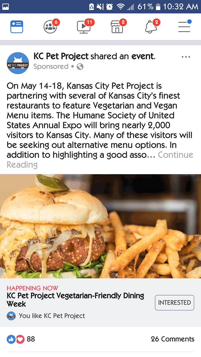
Users have to click “continue reading” in order to see the rest of the update. While this also can happen in desktop, what is the likelihood the shorter attention span of the mobile user to going to click “continue reading”? Try to make sure your updates aren’t getting cut off so users can read your message right when they see it, without having to take additional actions.
How to Write Better Mobile Posts
As marketers, we are always looking to make our lives easier, but automation can often come at a cost of lower quality posts.
This example is for a new ax-throwing venue located in the Kansas City Metro.

The @ mentions of other businesses aren’t clickable because Blade & Timber likely used some sort of automation or app to republish an Instagram post to Facebook. As a result, the text looks a little messy, especially because mobile users are used to clicking on words and usernames that have @ in front of them.
When automating post publishing, make sure you clean up the posts when you can edit them so they look more optimized for each platform. Additionally, even if they were just copy/pasting content manually, it’s worth copyediting all content to make sure everything looks right. In a manual post, the marketer could’ve made sure these were clickable if they wanted to keep the @ mentions.
Final Notes
Little tweaks on your social media, such as better images, cleaner CTAs written for smartphone users, and reformatted videos are all ways that marketers can make sure their content is better optimized for mobile viewing. Comscore via Marketing Land reports that users are spending more media time on their phones than desktop, so it’s important to cater to the majority use instead of assuming audiences will see updates on a bigger computer screen.
Want to step up your social media game even further? Woobox contests look great on mobile. You can create as many as you want and simply pay for a membership when you’re ready to publish. Give it a try.