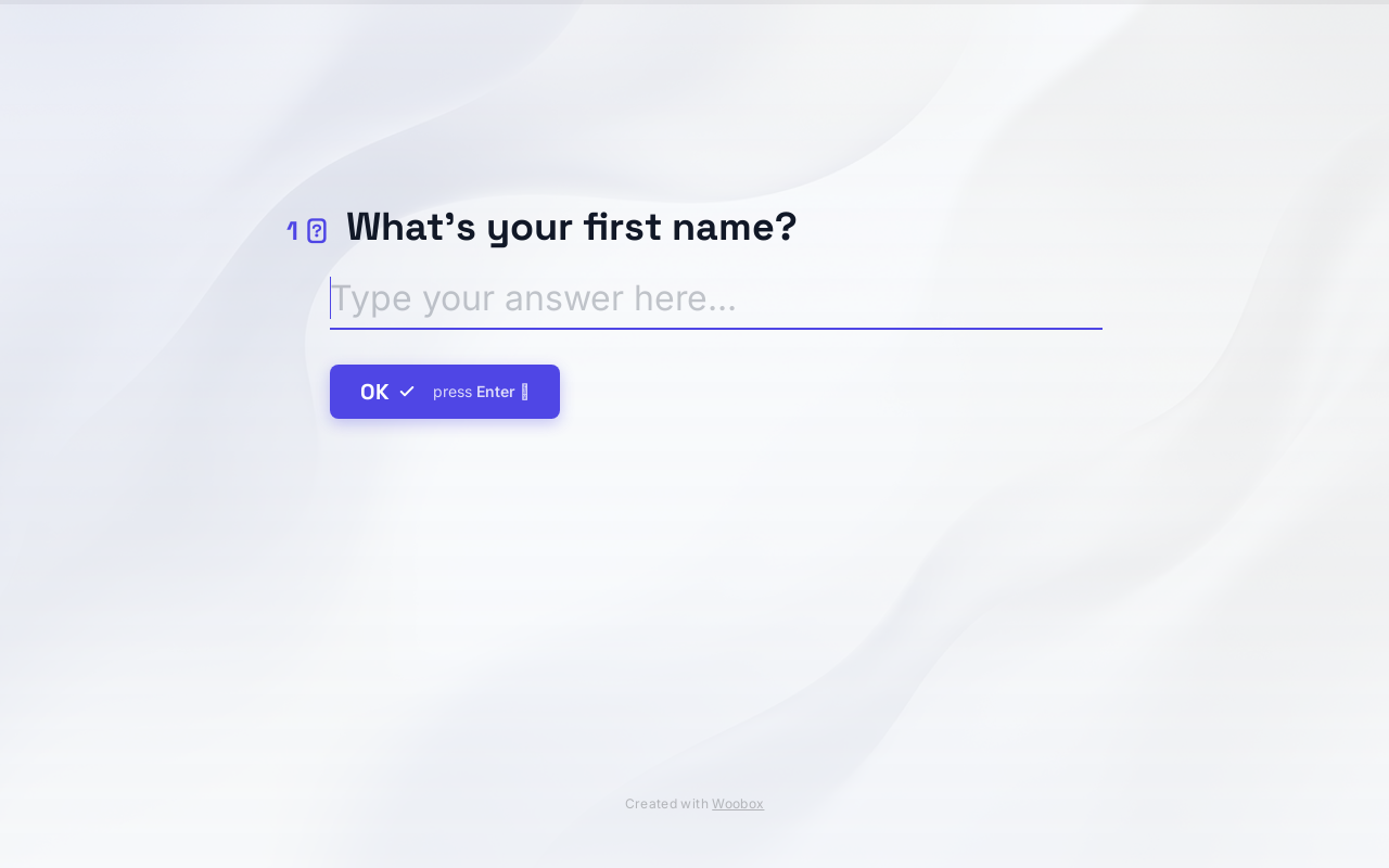
If your form has a 30% completion rate, you're already doing well. The average web form sits between 10 and 20%.
Conversational forms — the ones that ask one question at a time, feel like a chat, and show a progress bar — consistently beat that benchmark. Industry research from Typeform and HubSpot puts the typical lift at 2 to 3 times the completion rate of an equivalent static form, with the biggest gains on forms longer than six fields.
Here's why they work, six principles for getting the conversion lift in your own form, and a prompt you can paste into Woobox to build one right now.
Why conversational forms convert
A conversational form does three things a single-page form can't.
It hides the work. People decide whether to start a form in the first second they see it. Twelve textboxes on screen reads as homework. One textbox reads as a question someone asked them.
It rewards progress. Each answered question shows momentum — a progress bar fills, the screen slides smoothly to the next question. A static form gives no payoff until the very end, after submission. The conversational version pays the user a small dopamine hit every twenty seconds.
It can branch. When question 4 asks "Are you a homeowner or renter?", question 5 can change based on the answer. Renters don't see "How many bedrooms?" Homeowners don't see "How long is your lease?" Every question carries weight, which keeps the perceived length down without cutting the data you actually need.
Six principles for a form that actually converts
1. Lead with a question anyone can answer in two seconds.
The first question sets the pace. If your opener is "Enter your email address," you've already lost the trust battle — you're back to a static form with extra steps.
Lead with something effortless. A single-select question. A yes/no. A slider. The user invests two seconds, doesn't have to think, and is now committed to seeing question 2.
Good first questions: "What kind of campaign are you planning?" "Which best describes your business?" "Where did you hear about us?"
Bad first question: anything that requires the user to type.
2. Order from easy to hard.
The longer someone has been in your form, the more invested they are. By question 7 they've spent two minutes — they won't bail over an email field. So save the hardest asks (email, phone number, anything personal) for the back half.
This ordering also makes your abandon analysis useful. If 60% of users drop on question 2, your second question is too hard for that position — move it later in the form and watch what changes.
3. Branch hard.
A twenty-question form with branching can feel like a six-question form to any individual user. Map your branches before you build:
- B2B respondents skip every B2C question, and vice versa
- People who select "I want X" don't see questions about Y
- The "Other" path collects a free-text answer and exits the questionnaire early
Most form builders make branching painful — drag-arrows, condition panels, separate setup screens for each rule. Woobox lets you describe the branching in plain English ("if they say renter, skip the home-equity questions") and builds the logic automatically.
4. Show real progress.
A progress bar matters even when the math is fuzzy. A simple "Question 4 of 8" works almost as well.
If your form has heavy branching and the total varies by path, show progress as a percentage of their path, not the whole form. Telling someone they're on question 4 of 20 when their actual path is 8 questions is a confidence-killer right when you want them committed.
5. One question per screen — with one exception.
The "one question at a time" rule has one good exception: closely-related pairs. First name and last name. City and state. Day and month. Forcing these onto separate screens slows the form for no payoff.
If two fields conceptually belong together, group them. Otherwise keep it one at a time.
6. End with an easy ask, not the hard one.
A common mistake: putting the email field at the very end and treating it as a finish line. By the time you ask, you've earned the right to — but you've also handed the user one more moment to reconsider.
Better: drop the email field in the last third, then end with something light. A "How should we follow up — email or SMS?" picker. A "Anything else we should know?" optional text box.
The pattern is hard-ask, easy-close, submit. The easy-close question is your last commitment device.
Build one in about a minute with Woobox
Try this prompt:
"A conversational form to qualify B2B leads. Start with what kind of company they run, then branch into questions specific to their business type. Show a progress bar. Ask for email second-to-last, then end with how they prefer to be contacted. Match my brand colors."
Drop that into the Woobox prompt box and you'll get a working form with:
- Branched logic based on company type
- A real progress bar
- Mobile-ready layout
- A hosted URL you can paste into emails or embed on your site
Prefer to start from something proven? Browse the conversational form templates — pick the closest match to your use case and edit from there.
Skip the from-scratch setup:
- Conversational Lead Form template — the one in the hero. Replace copy, ship.
- All form templates — multi-step, registration, RSVP, lead capture, more.
When a static form is still the right call
A few cases stay simpler with a static form:
- Tiny forms (3 fields or fewer). The conversational benefits don't kick in below ~5 questions.
- Returning users on familiar forms. If users have submitted before and just need to refill, give them everything at once.
- Forms behind a login. Already past the trust threshold — speed beats experience.
For everything else — lead capture, registration, RSVP, event signups, surveys, multi-step quizzes — conversational beats static almost every time.
Build your first conversational form. Type a prompt or browse the templates. Free to start, no credit card.
Keep reading
More from the Woobox Blog




Build a campaign in seconds
Describe a giveaway, quiz, poll, survey, or coupon and Woobox launches a hosted, mobile-ready page in seconds. Free to start, no credit card.
Try Woobox free