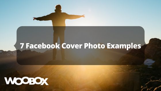
When visiting your Facebook business page, the first thing a consumer sees is probably your cover photo, if you choose an effective picture. But what makes a compelling picture? Check out these examples of successful cover photos by businesses using Woobox.
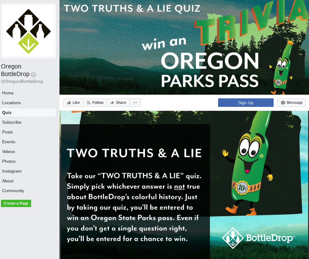
1. Oregon BottleDrop
Why it’s great: In their colorful and relevant cover photo, they’ve explained what type of promotion it is (a Quiz) and what an entrant could win (an Oregon Parks Pass).
By going to their Quiz, you notice that their graphic is similar to the cover photo, but not the exact same image. They also switched out the copy; in the cover photo, it is big bold print and limited text – straight to the point. Their offer provides more details on how to engage in the quiz.
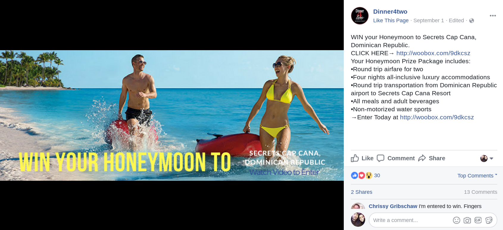
2. Dinner4Two
Why it’s great: Their photo is eye-catching all on its own, two people at the ocean having – what looks like – the time of their lives. They added a short line of “in your face” text telling a visitor to win a honeymoon! Instantly catching the viewers eye and interest.
As a bonus, on the entry page, Dinner4Two added a short 20-second video. When viewed it quickly shows the prizes, details, and pictures of the experiences an entrant would have on their dream trip. The cover photo grabs their attention and brings them to the entry page while the short and enticing video seals the deal.
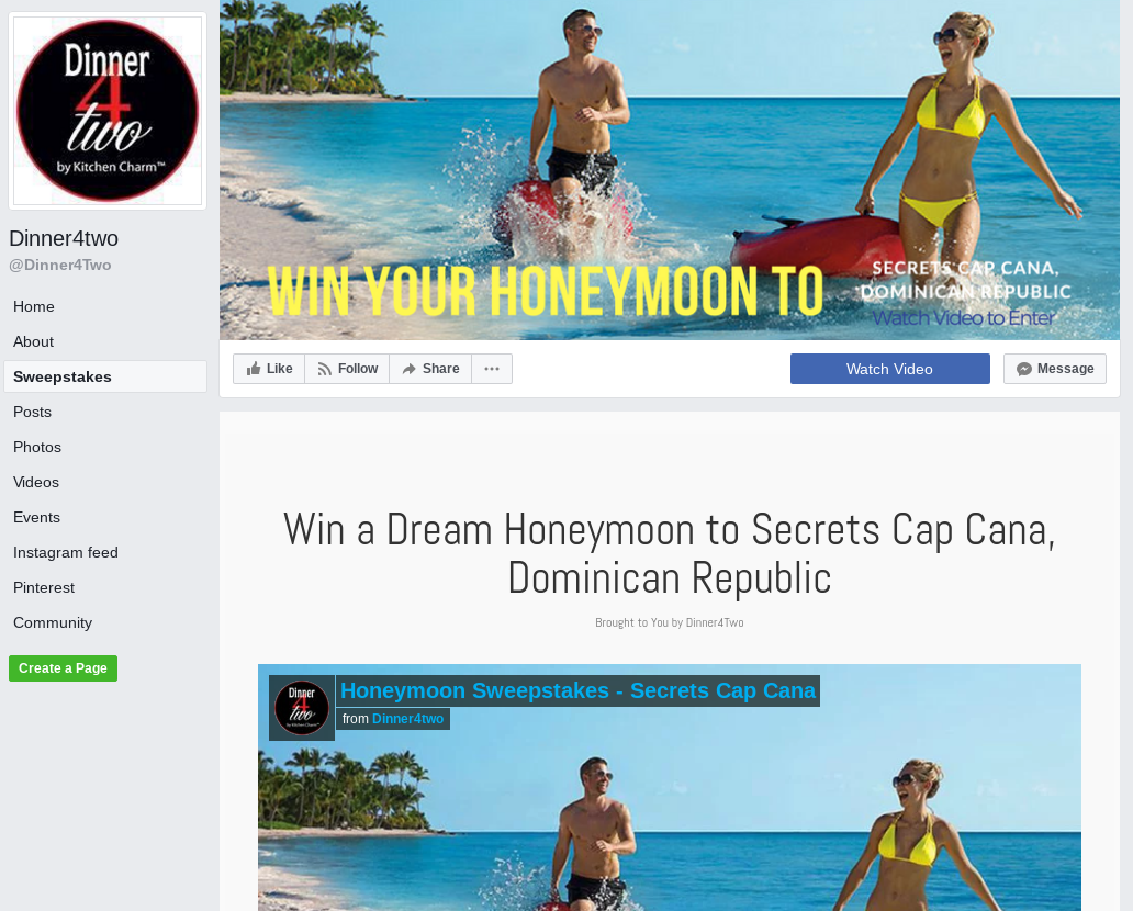
Even better, when their cover photo is clicked on, there’s a list of the prize details as well as the mobile and desktop friendly URL to their contest which is listed TWICE, making it even clearer how someone can enter to win.
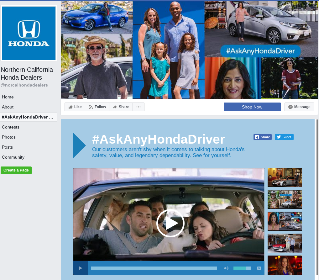
3. Northern California Honda Dealers
Why it’s great: Though cryptic, it shows what seems to be real-life, happy Honda owners and includes a simple but unique hashtag. When on a desktop, you can clearly see the displayed hashtag both on the cover photo and on the left sidebar as a tab since they named their tab the same as the text on the cover photo.
This is the hashtag that is used throughout their campaign. Northern California Honda Dealers use it in their cover photo as well as posts to their social media channels to engage users in their video contest.
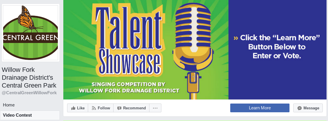
4. Willow Fork Drainage District’s Central Green Park
Why it’s great: This is a perfect example of using every part of Facebook’s tools to integrate with a Woobox campaign. Of course, they take advantage of the cover photo by using it for their contest, exhibiting bright colors and text that demands attention. But they also use their cover photo to state a very clear CTA by telling visitors to “click the “learn more” button below to enter or vote,” showing simple instructions on how to participate.
Additionally, they take advantage of the CTA button available to them as a Facebook business page. If you’re not using it now, consider using it for your Woobox campaigns, you can find more details on how to use Woobox with Facebook’s CTA button here.
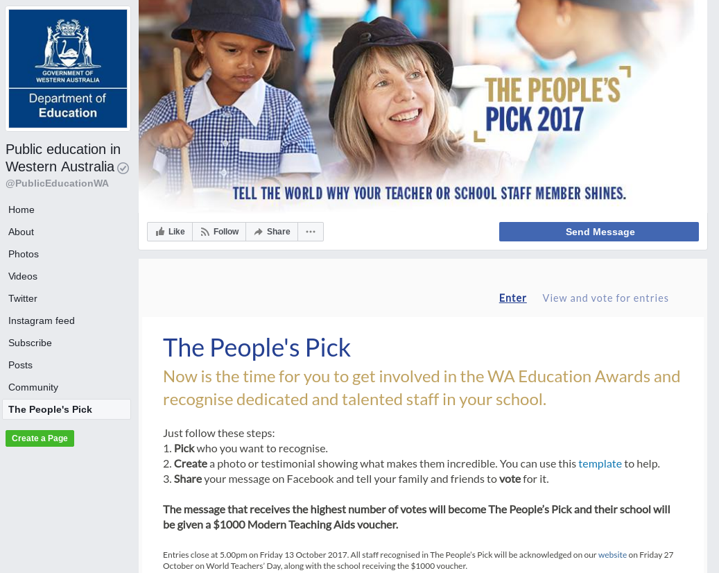
5. Public Education in Western Australia
Why it’s great: Another beautiful example of a photo of what (or who) the contest is about. Though a user viewing the page won’t know who the person in the picture is, they can imagine their teacher or school staff member who shines, like the one in the photo for promoting the contest.
Basically, if you choose a picture, whether it’s a stock photo or one you take yourself, make it relevant! And of course their image has limited text, but it displays that they have a contest and in one sentence it tells a user what they need to do to enter.
Once a user views their UGC contest they’re given much more detail on how to enter and how to win. An ideal cover photo should announce a contest and give enough details to bring a user to the competition itself. Use the entry page to provide all the particulars, just like this example.
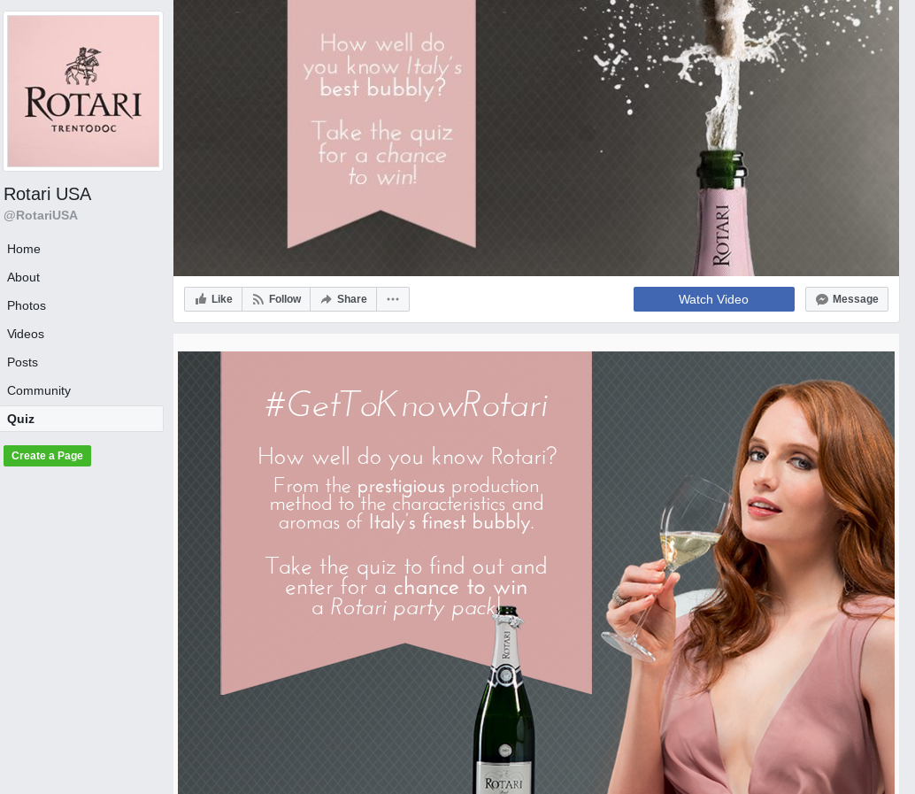
6. Rotari USA
Why it’s great: To keep the theme of their Facebook page, even once you’ve opened their Quiz tab. The color of their brand displays in their profile picture, and blends well with their cover photo and entry page, which both use the same shaped banner and background style. They make slight changes in imagery and in the color of the background from the cover photo to the entry page, but it’s still all nicely flowing together.
As with other examples, the cover photo gives the basics of the contest: take a quiz about Italy’s best bubbly and enter to win. Then when a visitor is on the quiz itself, it provides more accurate details.
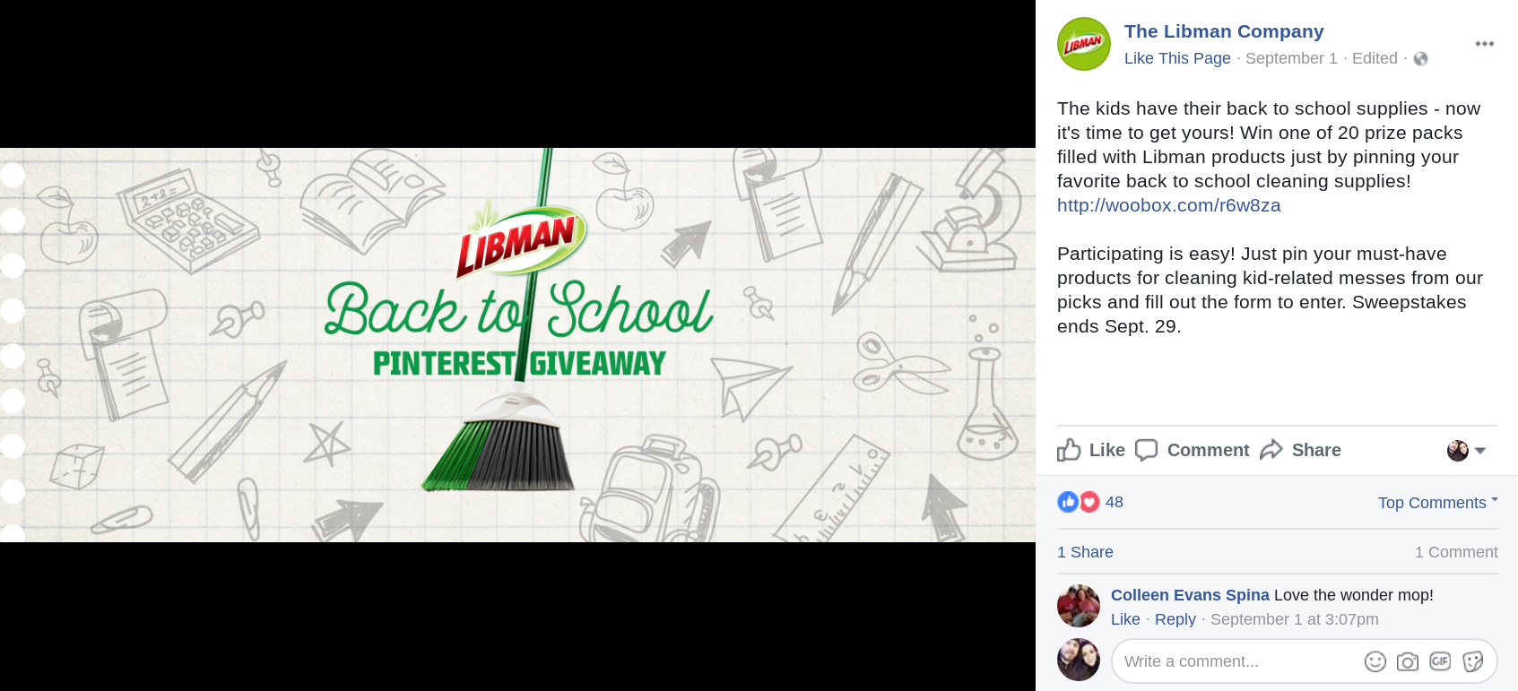
7. The Libman Company
Why it’s great: The Libman Company shows off a product and their signature brand icon, but they are not overwhelmingly promoting their contest. Though it’s less bold than other examples, it’s still a fun and clean-cut creative that gets to the point: they’re hosting a Pinterest Back-to-School Giveaway.
Clicking on their photo provides more information on how to enter, what they’ll win, and where to go to participate. The Libman Company used perfect copy to engage a user into entering, especially by letting them know that participating is easy!
NOTE:
Facebook’s cover photo specs are 828 x 315 pixels. 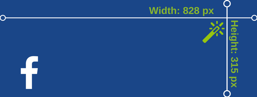
When creating graphics for your next successful campaign, don’t forget to make an image for your cover photo during the contest time-frame to get extra exposure. Login for free to set up your next successful offer! When you’re ready, purchase a subscription to go live. Have questions? Check out our forum or email your questions to support@woobox.com.